Skip to content

The Curse of the PDF in Environmental Reporting

My take is that a lot of the perception of 'green tape' actually comes from the system we choose to represent, collate and transfer our environmental data, and ultimately to explain our environmental position. We always end up using the PDF as that primary mechanism, but is it the best way?

Keith Dimech, Managing Director, Clair Advisory

17 September 2026 · 13 min read

How this was written

I really don’t want this feed to contribute to the sheer amount of AI slop that is being produced. So this is a qualifications section to explain how this was written, firstly these opinions are all mine and not stolen or otherwise lifted from someone else. I have written this article first from years of experience, making notes with a pen in a journal, then I transcribed it with voice to text, then polished it typing it up, before getting it online.

The interactive map was developed using the DERT platform. All the figures in the main article were built by AI, prompted by me.

The Curse of the PDF

When looking at a recently submitted contamination report which contained over 10,000 pages, my friend Sam Aldous coined the term “Appendixitus” to explain an environmental report which has maybe lost its way. It’s obvious that no one is going to look at even a small percentage of the report, but it was written anyway, because that’s what the system of the PDF requires. When giving environmental advice we are pressed to ensure that everything we say is defensible, so in compiling a PDF we put everything we can possibly put in there, in there.

The outcome is that these PDFs are long, slow to compile, and full to the brim with data. Conversely the PDF itself makes that data hard to extract, manipulate or test, so the report is hard to audit and hard to argue with. They are static, so they go out of date quickly, and two different parties often cannot use each other’s PDFs, so the work gets repeated or reworked or “attached” to each other. They are packed with information, but knowing where to look is near impossible. The best you can hope for is a Ctrl+F keyword search. They are built to be skimmed, not read.

Here is what I do instead

Yes, there is a PDF somewhere, but I like to pair it with a completely digital version that is interactive. It gives my customers a higher-variety system to inform them, so they can make the decisions they need to make, quicker. If we need to attach some attachments they are there, but in a way that makes sense (a tree photo is tied to that tree, a laboratory report is tied to the sample in the location it was taken).

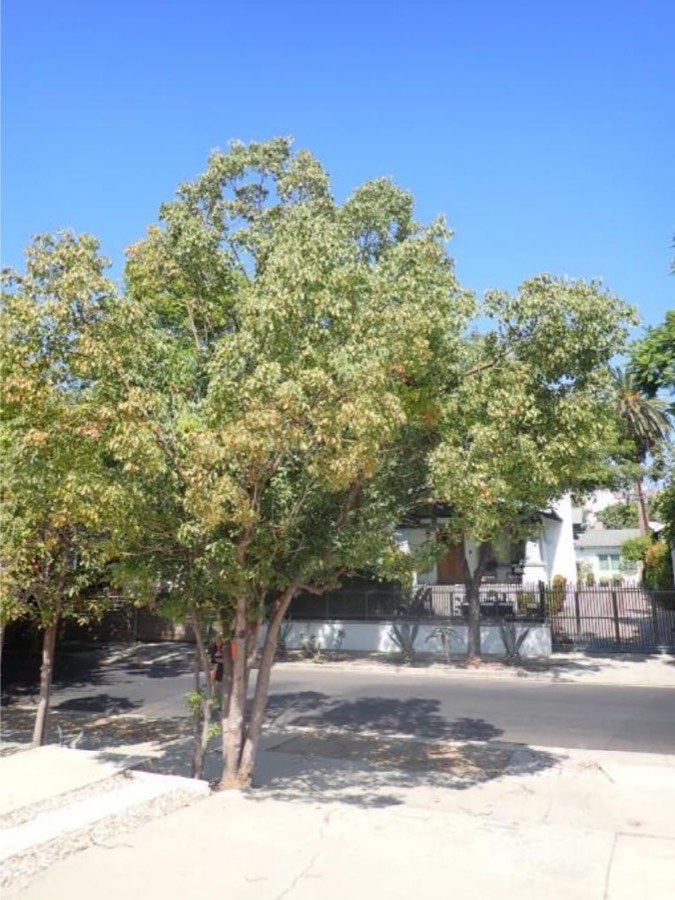
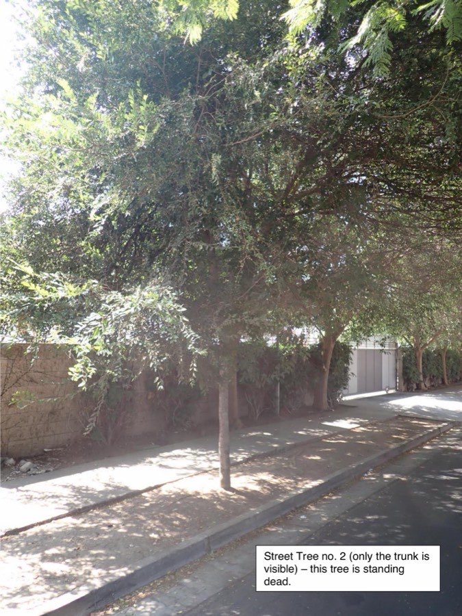
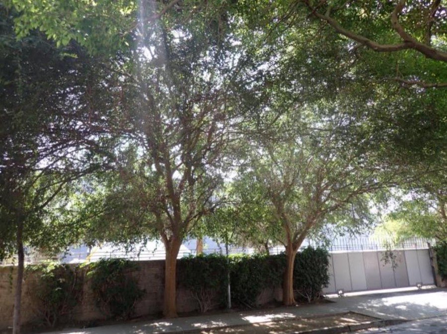
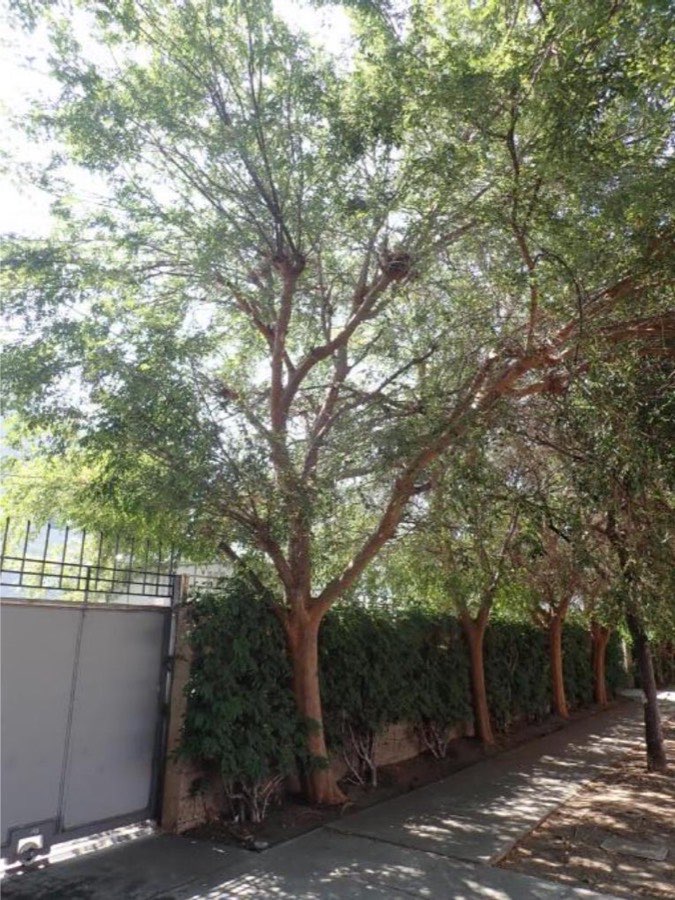
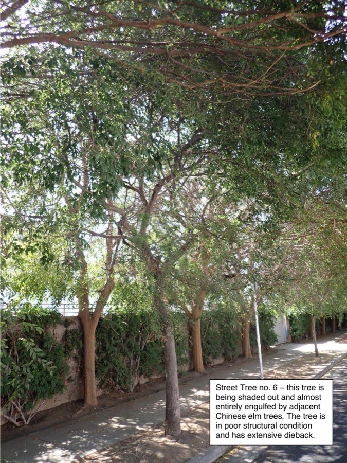
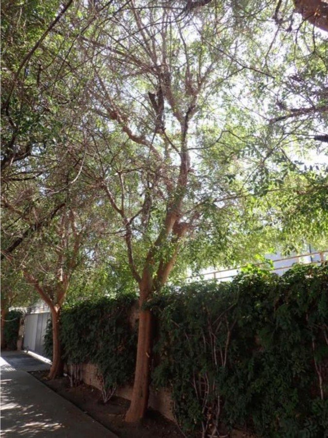
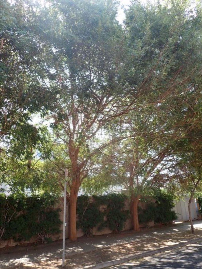
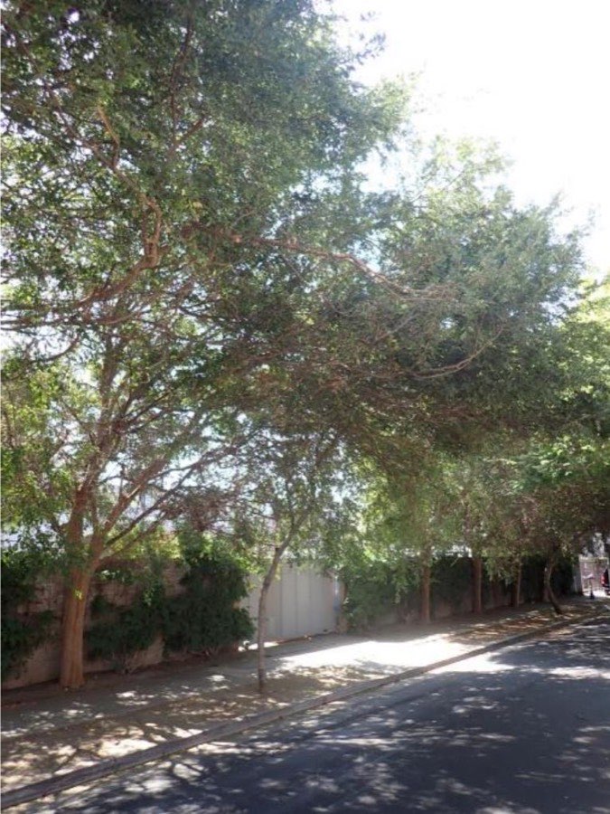
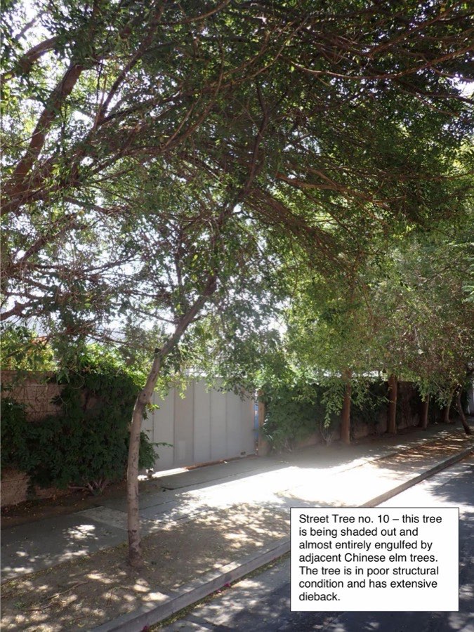
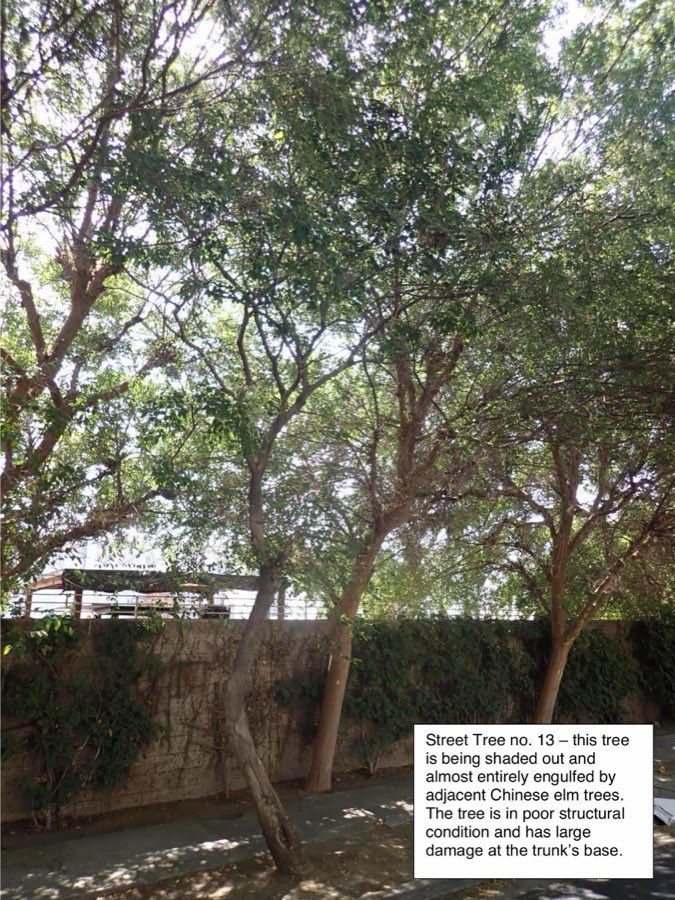
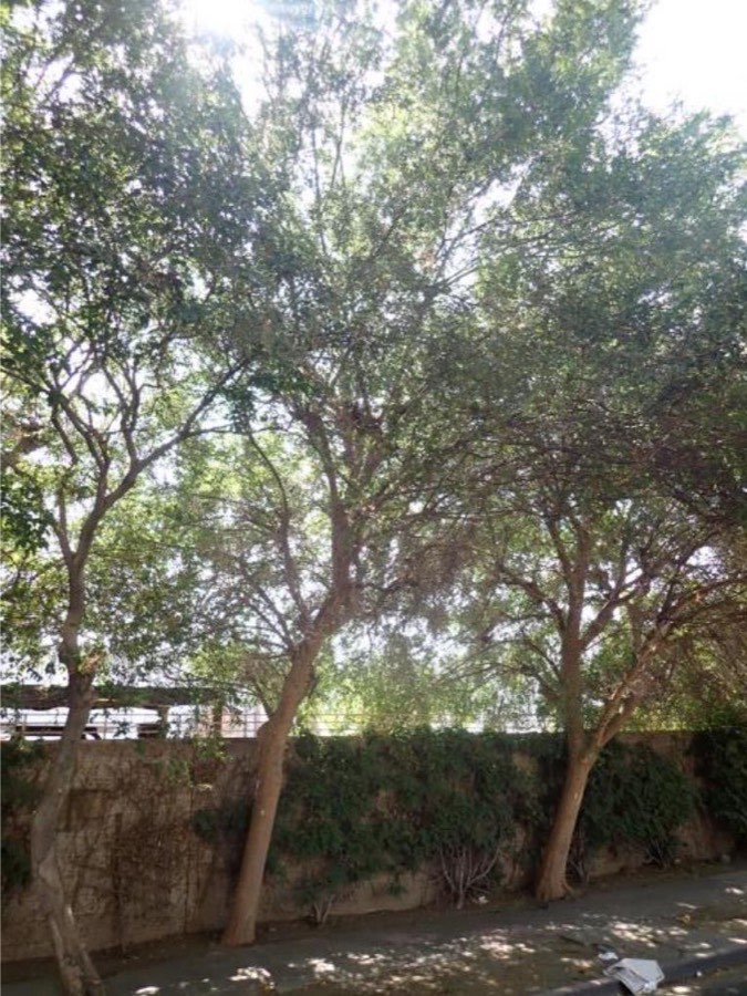
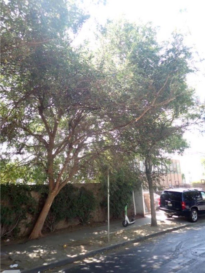
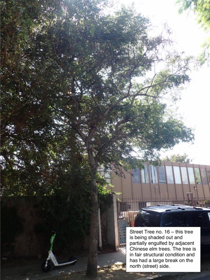
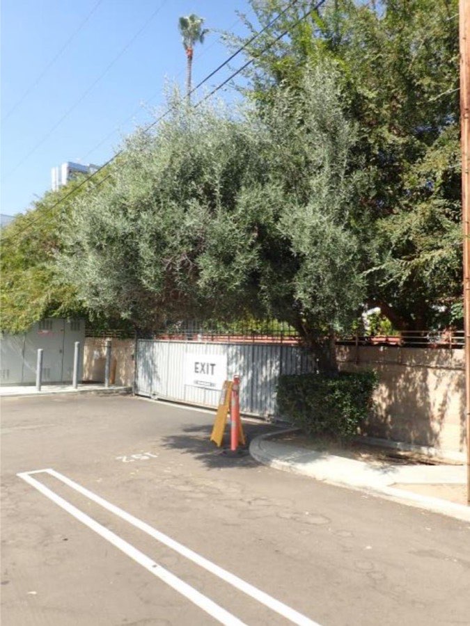
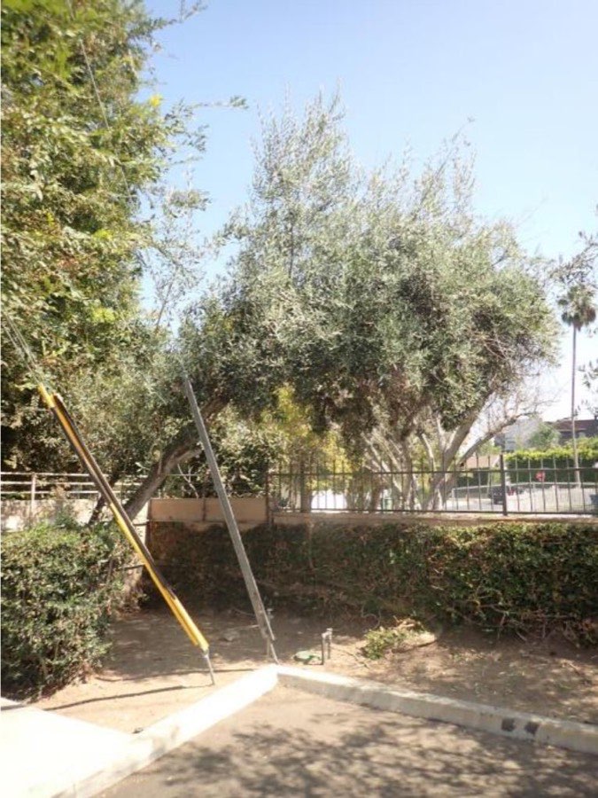
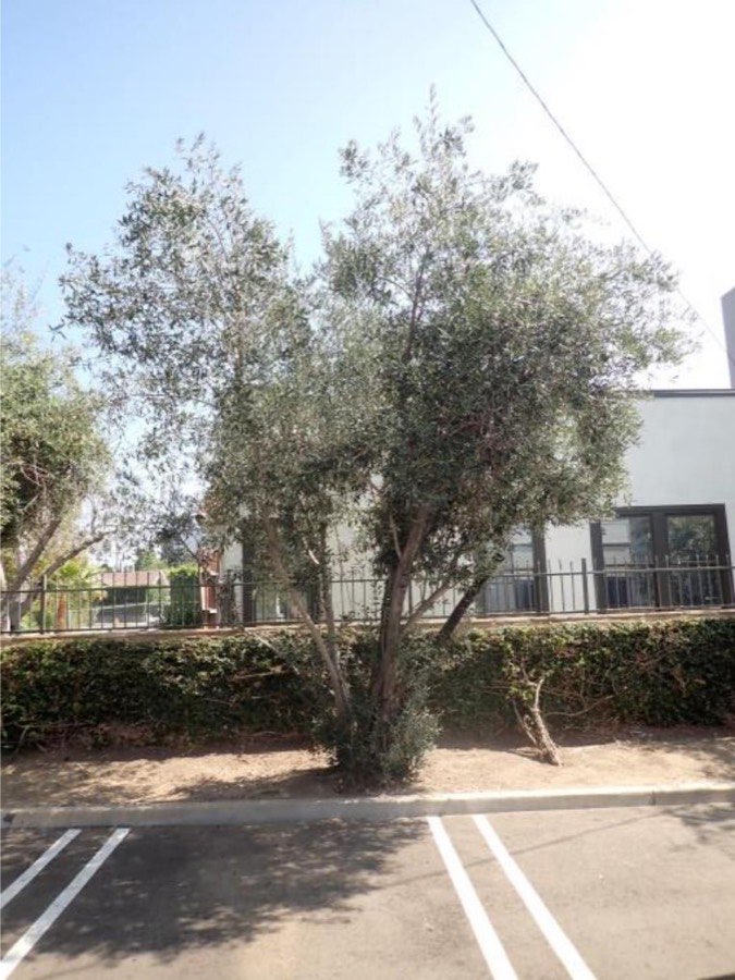
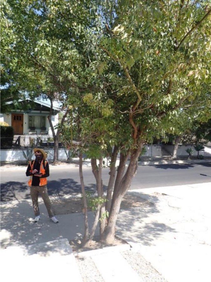
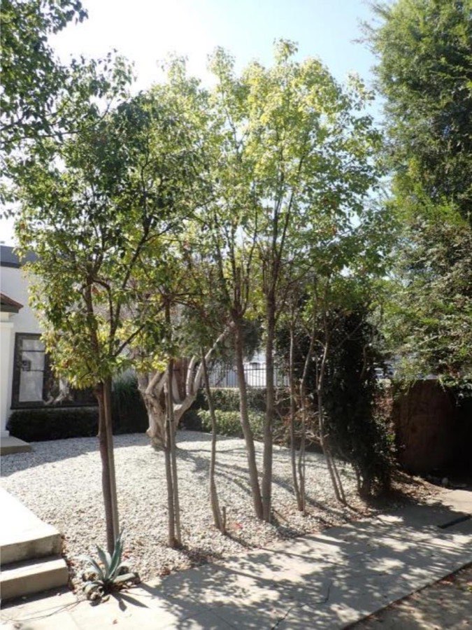
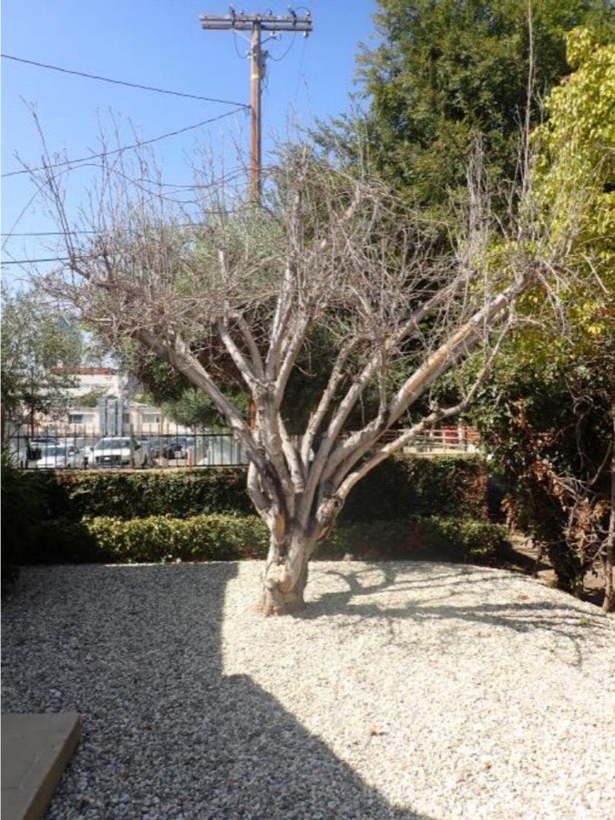
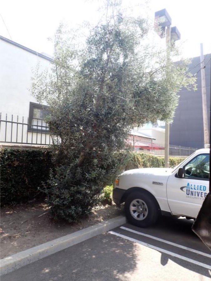
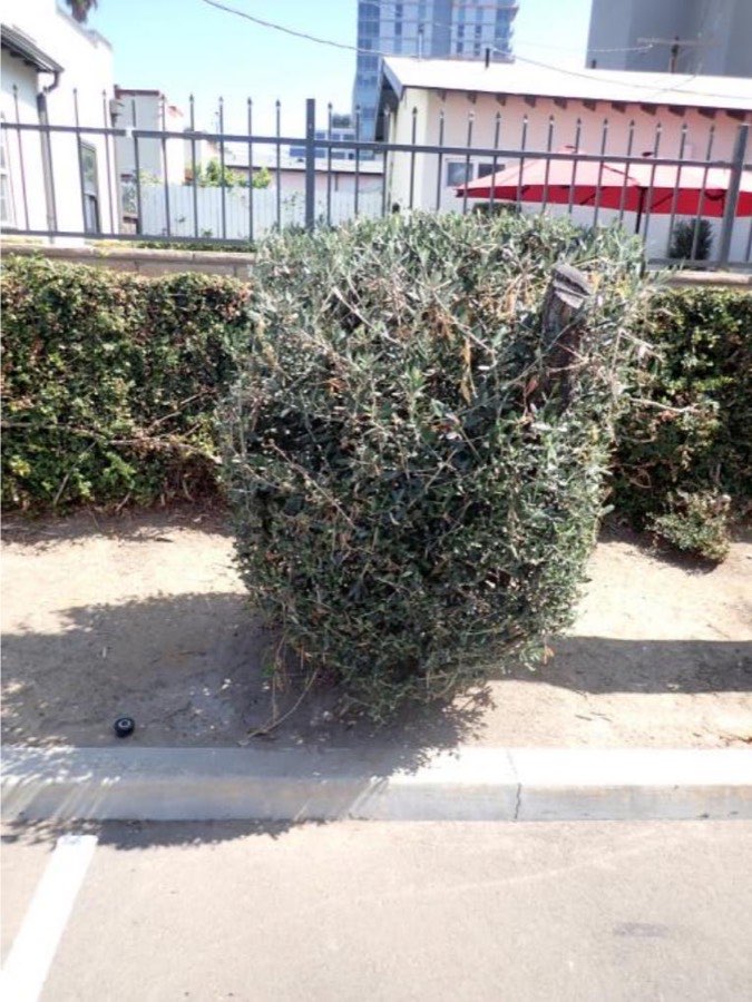
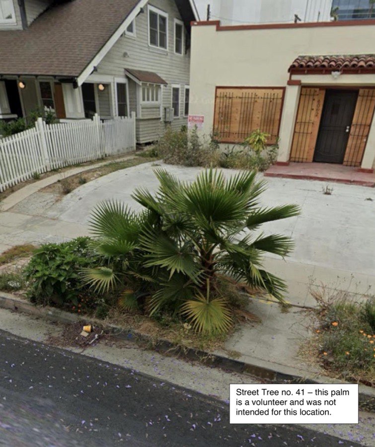
I’ve nicked this arborist report from a Los Angeles planning application for a simple redevelopment project. It is a typical one: 61 pages, of which 17 are photographs, 10 are tables of tree data, 4 are maps and aerials, and 19 are covers, CVs, a glossary, certifications and a bibliography. Only 11 are meaningful prose or analysis.

I rebuilt it as this interactive map, in a way that I believe trounces anything a PDF can deliver in storytelling, data analysis, accessibility and findability. Every tree, its photo and its data sit on one page, and the trees download as a CSV. Documents can be hosted and attached to the map. While this is just Trees, it could just as easily be Soil Contamination, Heritage, Geotechnical information. Have a play around. What do you think?

Turn your phone sideways

The Curse of the PDF

Want to read more?

13 min read

Read the full version ↓

The Curse of the PDF in Environmental Reporting

17 September 2026 · 13 min read

As an industry delivering infrastructure, we understand that one of our primary risks is how we manage environmental “green tape”. It is a loose and somewhat undefined term, but for the purposes of this post I want to focus specifically on the delays in how we collect and report environmental data for approvals, and how the primary system we use (the PDF) introduces inefficiencies and contributes to the general ‘green tape’ reputation of western capital projects.

What data do we usually collect?

Ask yourself in what ways we collect and interact with data. Think soil contamination levels, surface and groundwater chemistry, air quality, weather and rain, heritage findings, noise, trees, flora and fauna habitats, clearing limits, site inspections, photography, erosion, incidents, permits, audits, regulator interactions, meetings, waste tracking. Probably more.

Why do we collect this data?

  • Because it is in the contract, or there is a law that says so.
  • It’s not in the contract and it’s not a law, but we have a company procedure that mandates it.
  • To reduce harm or protect the environment (and have evidence of it).
  • To understand the risks and ensure we price correctly.
  • To not delay someone else trying to do their job.
  • To help price future work.
  • Because there is a government official who is being annoying.
  • Sometimes just because we did it last time, so we do it again out of habit.

To do this, the project looks outside itself into the environment, collects and stores the data, and presents it. Figure 1 uses the Viable System Model to break it down. I’ll keep coming back to it, and I promise it makes sense.

How do we store and communicate this data?

Lots of different ways but primarily through:

  1. An analysis platform of some kind, where the data is loaded and played around with (think Excel or GIS).
  2. Consolidated environmental PDF reports, both historic and newly written.

In slide 8 of the VSM diagram, we write the report to hand over information between two systems. In VSM we call this a transducer: the point where information is translated so it can cross a boundary, out of the operation and into the hands of someone who was not there. A regulator, a client, a reviewer in another office. Stafford Beer’s Third Principle of Organization sets the rule for that crossing:

“Wherever the information carried on a channel capable of distinguishing a given variety crosses a boundary, it undergoes transduction; and the variety of the transducer must be at least equivalent to the variety of the channel.”

Stafford Beer, The Heart of Enterprise (1979), p. 101

Put simply, a perfect transducer would allow the receiving system to have exactly the same understanding as the system that sent it. Anything that doesn’t make it through the transducer is lost, and the reader on the other side will either not know about it or have to ask for it.

When people talk about “Green Tape”, it is in many ways a neat way of saying bureaucratic delay: something that is causing the time between collecting environmental data and an approval (the “Green Gate”) to be longer than it should be. Much of the green tape problem can be traced back to poor transducers for presenting and communicating environmental data, and since we use PDFs almost exclusively, that should be a big red warning light.

Figure 01The environmental team drawn as a system, one part at a time — until it turns out to be one of three inside a larger one drawn exactly the same way.

01 / 08

01Start with the work

This is the work in a system that actually needs to be done. Without the work being done, the system is not viable. An example of System 1 work for the environment team might be "Obtaining a Tree Removal Permit".

02Someone is accountable

That work has to be controlled by someone accountable for its quality and for it landing on time. This might usually be the Environment Manager, who needs to be in charge of a suite of consultants who are working to "Obtain the Tree Removal Permit".

03The order matters

Scheduling and coordination. Alongside the arborist report, we also might need an ecologist report written. The Environment Manager will likely need a system to coordinate between these parties to ensure the tree names and numbers are all consistent.

04Systems like this work together

The environmental team is one delivery unit in something larger. Engineers, designers, quantity surveyors, HR, accountants and the people picking up the tools all have work of their own. The same pattern closes around them — the work, how it's managed, a coordinating channel.

05We are part of something much larger

To any system (project), the environment it lives in will always be bigger and more mysterious to the system. Watching and observing outside the project is a key Environment Manager task. An impacted neighbour. A nearby incident. A government changes. What trees are near us?

06Why we are here at all

The highest function of management holds the purpose. Be careful here: your system's purpose isn't what you want it to be, and it's not a mission statement. The purpose of the system is what it is currently doing. So while you might want your purpose to be "Ensure environmental excellence", the real purpose might be "make sure that if anything goes wrong, there is a document proving it wasn't us".

07Environmental Reporting

So as you can see here, the Arborist Environmental Report is the output of System 1: the way the Environment Manager has chosen to represent the environment in service of the System 1 process "Obtain a tree removal permit".

08The report crosses into the council

Zoom out once more. The council's permitting team is System 3 of a larger system, and our project is one System 1 among many: other projects, residents. Our report is the transducer on the line between them. System 3 cannot take in everything from every System 1, so something has to be reduced. The council should decide what gets reduced, not the PDF format. Otherwise a System 1 is deciding what System 3 sees.

An eight-step build-up of Stafford Beer's Viable System Model.

A Recent Arborist Example

On a recent project, we needed to repair a major sewer.

  1. The water authority needed a critical sewer repaired.
  2. The repair required us to remove a few hundred trees.
  3. Removing them required approval from the local government, so we had to communicate what we were doing (via a transducer) so they could make a decision or provide advice.
  4. That involved having an arborist go out and collect data on each tree that was going to be removed.
  5. We also needed an ecologist to assess how much native vegetation we would be removing.

The arborist used a series of systems to do it (see Figure 2).

You will notice that step 3 is not “write a PDF”. It is to give them the information from our tree data so they can make a decision. The best transducer would give them all the information from every system in Figure 2: GIS files, Excel files, design drawings, photographs and AutoCAD files. That is not the convention, most likely because of the mess it would create and the obvious issues around data control and software access. It is much simpler to package everything into one PDF.

Everyone wants the PDF. They expect it, and it is the convention. But I want to take you back to step 3: the purpose of this work is to communicate what we are doing so the local government can make a decision. The PDF is one way of getting that to them, but is it the best one? Here is where I think it falls short.

Figure 02The eight systems behind one arborist report. Click any one of them to read what it holds — seven hold something a computer can be asked a question about, and the eighth holds a picture of the other seven.

One arborist report
01 / 08

Select a system.

Collect · step 1 of 8

Government datasets

Historic tree records the state already holds. You query them before anyone walks the site, and they tell you what was there last time someone looked.

Collect · step 2 of 8

Tree plotting software

Every tree on the alignment gets a point and a set of attributes: species, height, health, retention value.

Collect · step 3 of 8

GPS and camera

Position to the metre and a photograph of each trunk, captured in the field on the day.

Produce · step 4 of 8

Excel

The schedule comes out as a table. One row per tree, one column per thing that was recorded.

Produce · step 5 of 8

AutoCAD

The design and the clearing limits. Which trees fall inside the line and which ones do not.

Produce · step 6 of 8

ArcGIS

The map. Points, clearing limits and aerial imagery, in layers that can be turned on and off.

Produce · step 7 of 8

Word

The report is written around the table and the map. Three pages of prose, then the appendices.

Lock · step 8 of 8

Acrobat

Our Final Transducer, the way we combine and reduce the complexity of all these systems into one report.

Eight systems used to produce one arborist report. Select any one of them to read what it holds.

PDF Problems

Why PDFs are bad transducers

Length

A Tree Assessment PDF is usually three pages of prose explaining the project and objectives. A PDF table of the trees, numbered in the order they were surveyed, exported from Excel. A map of where those trees are, exported from GIS. Then a photo log of the trees listed with their details, exported from the tree mapping app.

This works fine for a small scope of five to ten trees. One person can look up the table, find the tree on the map, go and look at the photo, and make a decision. When the tree numbers start rising the report size grows with them. The tables become so long, the maps so big they split across multiple pages, the photographs so similar, that the ability to analyse or audit the report becomes next to impossible.

The report is trying to hold the variety of the site. It cannot, so it gets longer instead. Length is not capability. A thousand pages of tree table has no more answering power than the spreadsheet it was printed from, and considerably less ability to filter, review, add to or investigate.

Accessibility

What if we wanted to filter and just see the trees of high retention value? Just the trees over 40 m? Just the trees near our new road?

We can’t filter a PDF or a static map. So we are left with asking, and paying, the consultant who wrote the report to do it for us and export a new PDF. Or asking for the raw data and filtering in Excel, or uploading it into GIS software if we have access. Typically when these reports are supplied the additional data isn’t provided, especially when we submit to regulators. They just get the PDF, which makes their job very hard to properly audit or investigate.

Timing

On this sewer project, the first preplanning started four years before the job was completed, by a water authority using a different arborist to us, the eventual builder. During the tender we looked at the original plan and suggested a completely new, cheaper way to build the sewer that took a different route, and therefore hit completely different trees.

Once we won, the tree report we had from the client was not fit for purpose. We also couldn’t get access to the data, so all we had was the tree plan, which was the wrong area and out of date. We tried, but taking the four-year-old data out of v1 was not deemed a good way to spend time and capital, so we just mapped all the trees again. That made the first version a waste of money.

Real-time access

The arborists mapped diligently and quickly, and within three weeks had traversed the eight kilometres of pipeline where the trees were. All the while our design team was planning the roadways, access paths and laydown areas.

What would have been incredibly useful is for the design team to have access to the location and importance of the trees we were finding, in real time. Instead, because of the PDF, we need to wait for all the trees to be mapped and the assessment to be written, which takes another few weeks on top. Designs go on hold, or worse, go ahead without the data.

Coordination

While we had the arborists out looking specifically at trees, we also needed an Ecology Assessment to understand how much native vegetation we would be removing.

The ecologist’s job is not to map every tree, nor do they necessarily have the training to know exactly which trees they are looking at. They are responsible for a report that goes to a regulator stating which of the trees are deemed significant. They are a different company, using different and less sensitive GPS tools, working to state regulations rather than the Australian Standards the arborist used.

This needed me to act as a System Two, scheduling and organising the alignment between the parties. I had to wait for both to complete their PDFs, weeks after the data was available, review both, find the discrepancies and ask both parties to rewrite and align.

Auditing

The regulators who approve these reports only ever see the PDF version, never the accessible data beneath it. Auditing that data to confirm it is accurate means looking at 1500 individual lines, fifteen pages of A3 maps, or a very long table. Even the best auditor in the world can’t do that without burning time they don’t have.

Regulators have likely seen hundreds of similar reports covering the same areas with the same data types inside them. They may even hold a GIS database of every tree in the council area or the state. If a regulator could compare this report against the last one for the same ground, the differences would be the assessment. Instead they get a fresh document that knows nothing about any document that came before it, and they read it from the start like it is the first one.

Appendices

By comparing two reports we can see historic data in today’s context. Was there a tree here four years ago? Has it grown? Is it healthy? Did we cause that damage? Comparing reports shows us data changing through time.

Unfortunately this is very difficult with a PDF. Typically we read the old report, take what we think is important by comparing page by page, and then stitch the two together by adding one as an appendix. As if anyone was ever going to read it.

01 / 07
The sections of the argument.

Value / Failure Demands

I now want to add a second systems tool: John Seddon’s concepts of “value demand” and “failure demand”. Value demand is the good one. It is when a system is working directly in response to a customer, for the reason you want it to (a customer calls the sales line to get a quote for some work). Failure demand is when a system spends its time reacting to things it shouldn’t have to (a customer calls the sales line to complain about the quality of the work). By identifying what your value and failure demands are throughout your pipeline, you can work out what to focus on to improve productivity. To see how this works in the world of green tape, take a look at Figure 3. It shows the value demands from the arborist assessment (what should happen in a perfect world), then what actually happens once the failure demands are included (click through the figure). Each failure demand extends the time between value demands, which is to say it adds green tape.

Figure 03The time difference between perfect reporting program and when we map the true failures.

Value vs failure demand

Value demand

  1. 1The water authority asks the project for a critical sewer repaired.
  2. 2The project asks the environmental team for the trees above the sewer removed.
  3. 3The local council asks the environmental team for enough information to decide on the trees.
  4. 4The environmental team asks the arborist for every tree mapped and assessed on the ground.
  5. 5The environmental team asks the ecologist for the native vegetation assessed.

Failure demand

  1. 1The design changes. The report is a PDF and cannot take a partial update, so the arborist writes a new one and the job waits two weeks.
  2. 2The water authority had already mapped these trees on an earlier project. The report was lost, so every tree is mapped again.
  3. 3The arborist and the ecologist number the same trees differently. Both reports go back to be rewritten.
  4. 4Nothing goes to council until every report is finished. The data is six months old when the council first sees it.
Swimlanes for six parties on the sewer job. The value demand path takes 7 hand-offs; with four failure demands it stretches to 16.

What is the solution, then?

Essentially, we need to keep the full picture intact at every hand-off, so the transducer carries as much as the data does. Clair does this in two ways.

DERT: Diagnostic Environmental Reporting Tool

We use the geospatial DERT platform to manage all our environmental data. It works as a single data base which is viewable through a geospatial frontend. In one place we can hold ecology, arboriculture, soil & water chemistry and geotechnical information. It allows the user to view and see planning overlays, upload GIS and AutoCAD files or draw their own shapes to analyse the data as it comes in. I have tried to show how this might work from the perspective of four different users in Figure 4.

How this helps:

  1. One record over time. When a four-year-old survey exists, its data can be extracted and viewed on the same map, so we can see which trees have grown, got sicker or already been removed. The council can check our trees against its own register and flag the ones its community cares about, before anything is written up. The next project has access to both, and the repository keeps growing.
  2. Live from the field. On our projects, any environmental data being collected is reported live and viewable in DERT. When the arborist maps a tree, it goes straight into the geospatial record, where anyone with access to the project can see it. We are focusing on trees here, but it could just as easily be soil sampling, ecology or geotech, all coming in live from the field.
  3. Accessible to everyone who needs it. Anyone can be given access. The road designer can see the trees and make decisions on the fly, without waiting for the Environment Manager to call a meeting or send a report. An ecologist who notes a habitat tree can add it to DERT before the arborist gets there, and the arborist checks it off on the way past, instead of the two of them creating failure demand by naming or classifying the same tree slightly differently.

Figure 04The previous survey, the field systems and the design, going into one record instead of a PDF.

Looking as

Survey complete · 1,500 trees in one record

0 km1 km2 km3 km4 km5 km6 km7 km8 kmDesign v1 · assumed alignmentDesign v2 · day 7 · moved off tree 400Design v3 · day 11 · moved off tree 795Clearing limitprevious survey endsTree 400 · endangered · flagged day 6Tree 400 · missing from the registerTree 400 inside the clearing limitTree 400 kept · road moved day 7+ 2 notesTree 795 · habitat tree · noted by the ecologistTree 795 flagged by the ecologistTree 795 kept · road moved day 11crew02 km
  • Datasets
  • Plotting
  • GPS
  • Excel
  • AutoCAD
  • ArcGIS
  • Word
Tree table · 1,500 rows
TreeSpeciesHeightConditionPhotos
400Buloke · endangered26 mGood3
1500Sugar Gum18 mFair1
Habitat trees · 5 noted
TreeSpeciesNotedArborist
463Yellow BoxBefore the crewChecked day 7
795Grey BoxBefore the crewChecked day 10
1065River Red GumBefore the crewChecked day 12
1309River Red GumBefore the crewChecked day 14
Register update · day 15
ChangeTrees
New to the register40
Removed since the register30
At risk15
Confirmed as recorded550
Design register · rev v3
RevIssuedChangeTrees in clearing
v3Day 11Moved off tree 795709
v2Day 7Moved off tree 400751
v1Before the crewAssumed alignment784
Previous surveyMapped this surveyEndangeredCurrent designEarlier designClearing limitTree the road moved forHabitat tree noted by the ecologistChecked off by the arboristOther treeOn the register, not yet surveyedConfirmed as recordedNew to the registerRemoved since the registerAt risk↑ grown · ◯ declined · × removed
A plan view of an 8 km sewer alignment in DERT. The previous survey loads first, then trees are mapped day by day, the design and notes arrive, and each person reads the same record for what they need.

Document Intelligence

From DERT we can produce smarter reports. There is probably no getting away from the PDF, but what I would love to see is every report paired with a digital version that is interactive, filterable and visual. Instead of fifteen pages of A3 maps and a long photo log, an interactive map. Instead of a picture of a table of trees, a downloadable CSV of the trees.

So I will leave you with this. I took an arborist report from a simple redevelopment project in Los Angeles. It is a typical one: 61 pages, of which 17 are photographs, 10 are tables of tree data, 4 are maps and aerials, and 19 are covers, CVs, a glossary, certifications and a bibliography. Only 11 are meaningful prose or analysis.

I rebuilt it as this interactive map, in a way that I believe trounces anything a PDF can deliver in storytelling, data analysis, accessibility and findability. Every tree, its photo and its data sit on one page, and the trees download as a CSV. Documents can be hosted and attached to the map. While this is just Trees, it could just as easily be Soil Contamination, Heritage, Geotechnical information. Have a play around. What do you think?

Figure 05A 61-page arborist report, rebuilt as one live tree map. Filter the trees, open any one, and read the summary beside it.

References

The two systems ideas this article leans on, and where to read them properly.

The Viable System Model: Stafford Beer

  • Brain of the Firm (Wiley, 1972; second edition 1981). Where Beer first sets out the Viable System Model.
  • The Heart of Enterprise (Wiley, 1979). The source of the Third Principle of Organization on transduction, quoted in this article (p. 101).
  • Diagnosing the System for Organizations (Wiley, 1985). A workbook for drawing your own organisation as a viable system.
  • My friend Adam Thompson gives a great introduction to how the model works and how to use it to diagnose what’s going wrong. Watch Adam’s introduction.

Value and failure demand: John Seddon

  • Freedom from Command and Control: Rethinking Management for Lean Service (Taylor & Francis, 2005). Where Seddon defines failure demand as “demand caused by a failure to do something or do something right for the customer”.